

How we turned Kriya Engineers into a modern engineering brand
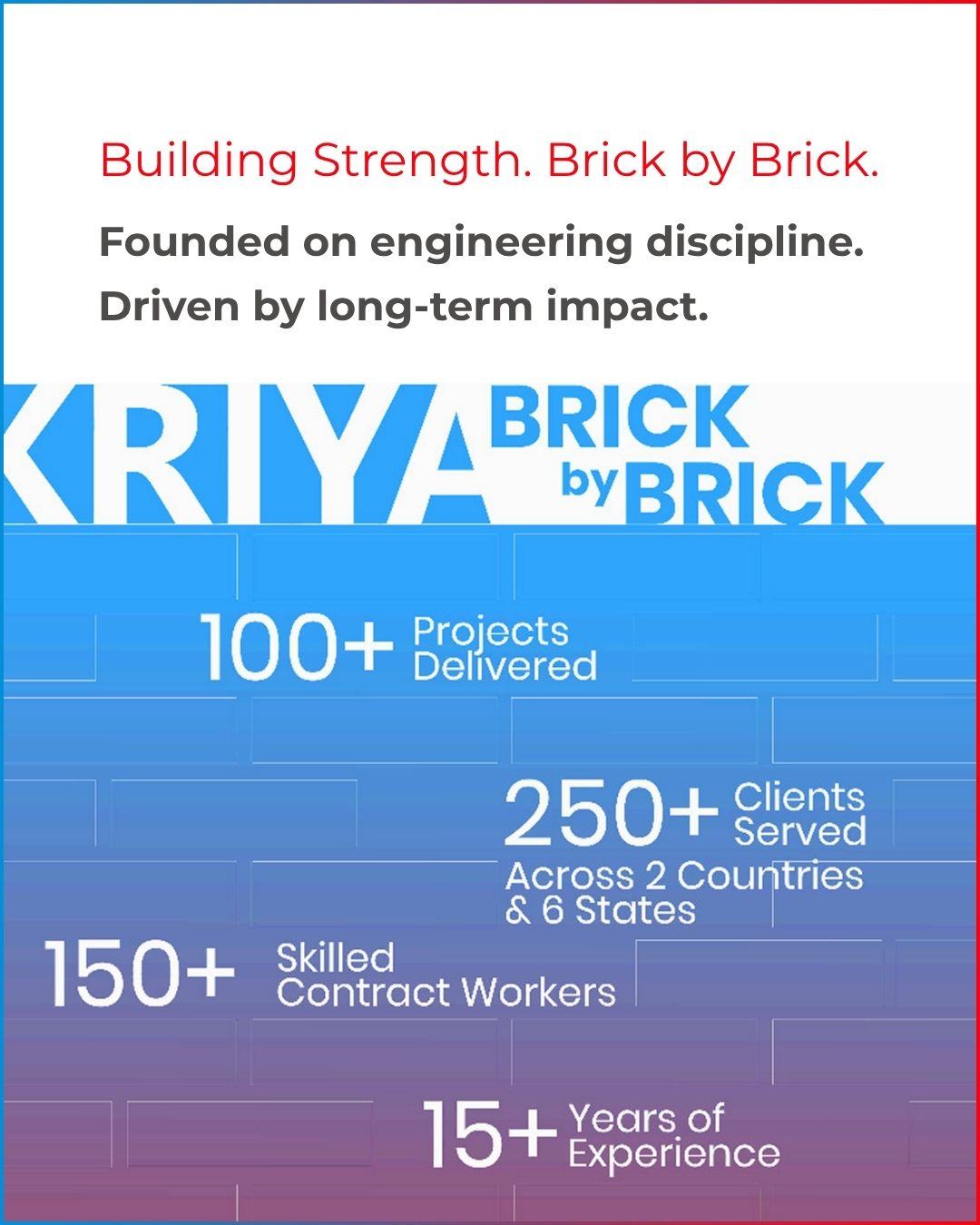
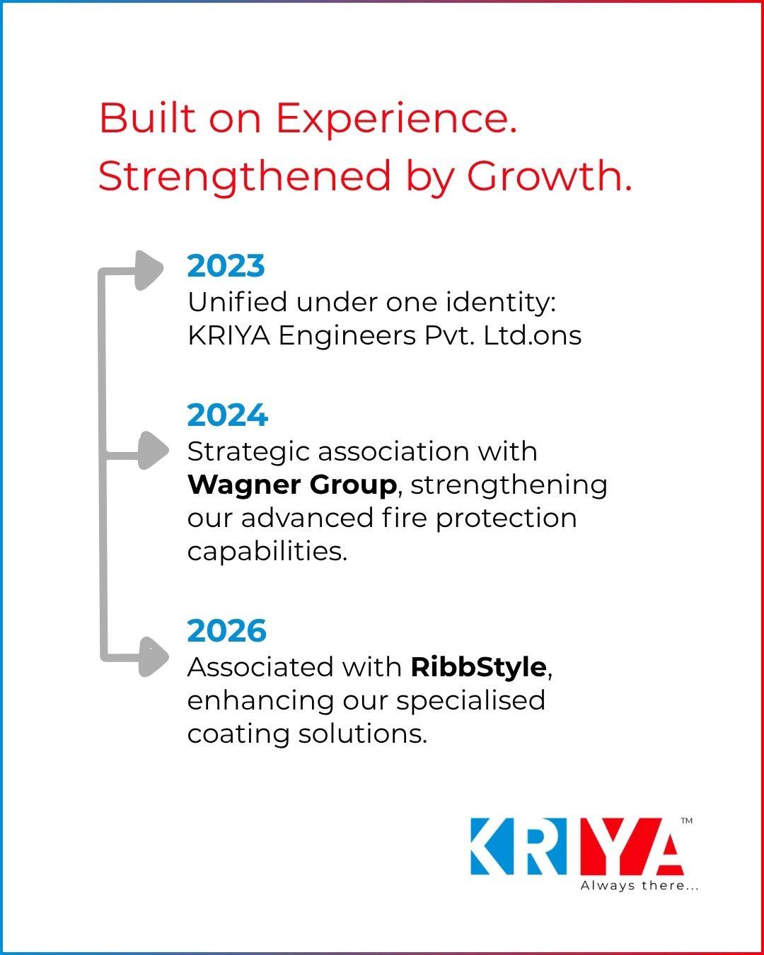
Kriya moved from a service driven company to a brand that communicates trust, innovation and reliability at every touchpoint. We built the strategy, the logo and identity, the office experience design, the social media presence and the website, and we now run their marketing.
- Sector
- Cold chain and passive fire protection
- Market
- India
- Year
- 2026
- Brand strategy and audit
- Logo and brand identity
- Stationery and office experience design
- Company profile and video
- Website design and development
- Social media management
The challenge
- Seen as a service vendor rather than a strategic partner.
- Communication was technical instead of engaging.
- No consistent identity across touchpoints.
- Limited digital presence.
- No emotional connection with the audience.
What we discovered
- The company talked about what it does, not why it matters.
- Trust was built on performance, with almost no brand recall.
- The identity felt dated and unstructured.
Repositioning the brand
We provide engineering services.
We protect life, preserve freshness and enable safer operations.
This line became the foundation for every design and communication decision that followed.
Our approach
- 01
Strategy and brand audit
We reviewed how Kriya was seen by clients, partners and staff, then defined a single story the whole company could stand behind.
- 02
Logo and brand identity
A complete identity system with logo, typography, colour, graphic language and iconography, documented so every team can use it correctly.
- 03
Physical experience design
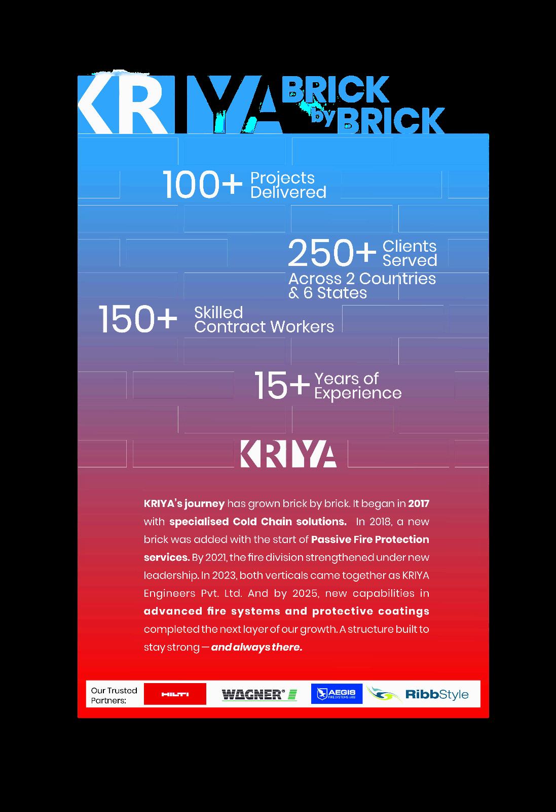
Journey wall, entrance wall, conference wall and a full stationery set, so the brand feels the same in the office as it does online.
- 04
Digital and social transformation
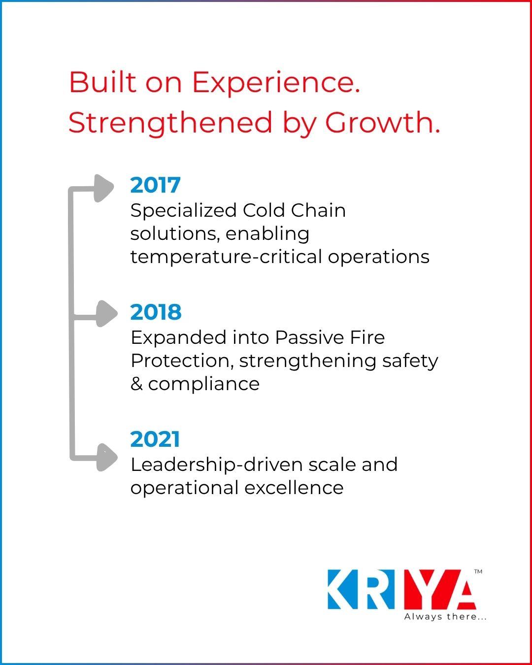
A consistent content system across channels that explains the work in plain language and builds recall month after month.
- 05
Company profile and video
Sales ready collateral that carries the new positioning into meetings, tenders and site visits.
- 06
Website design and development
A clear, fast website structured around the two service verticals, with pages built to earn enquiries.
Building the identity
The logo concept
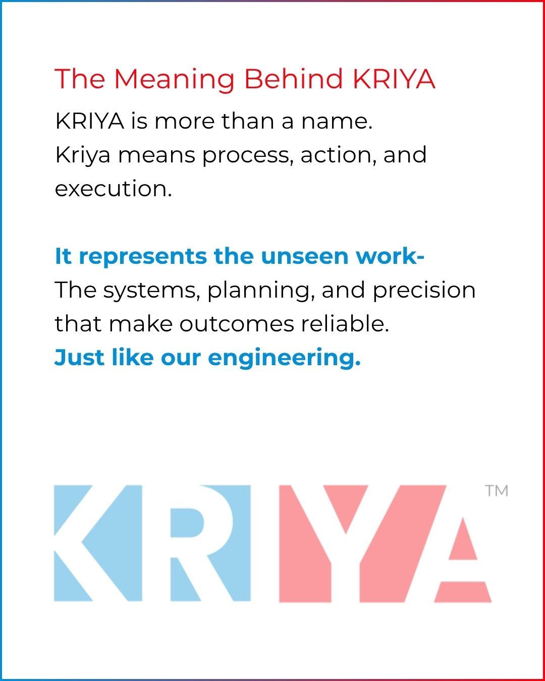
The KRIYA wordmark sits partly hidden behind the colour blocks, a nod to the invisible work behind reliable engineering. The bold letterforms carry impact, while red and blue represent the two service domains: fire prevention and cold chain.
Typography
Poppins Bold for the logo, a geometric sans serif with clean rationalist lines. Montserrat Regular for the tagline and body text, highly legible across print and web.
Graphic language
Flat red and blue lines, translucent gradient triangles and squares, frosted glass surfaces and negative white lines cutting through KR(I)YA.
Iconography
Google Material Sharp icons, chosen for their engineering feel and consistency at every size.
The work in use
Where it landed
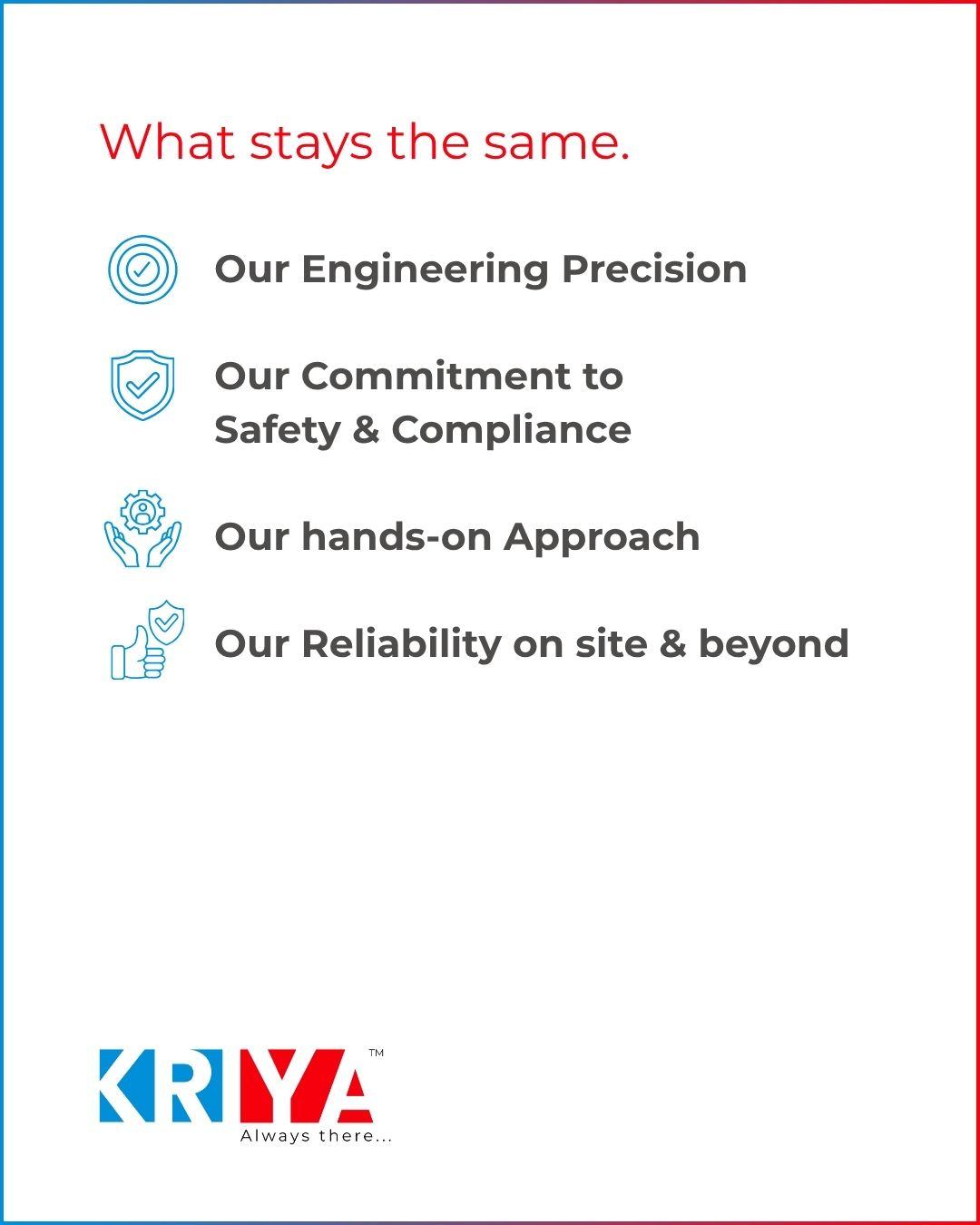
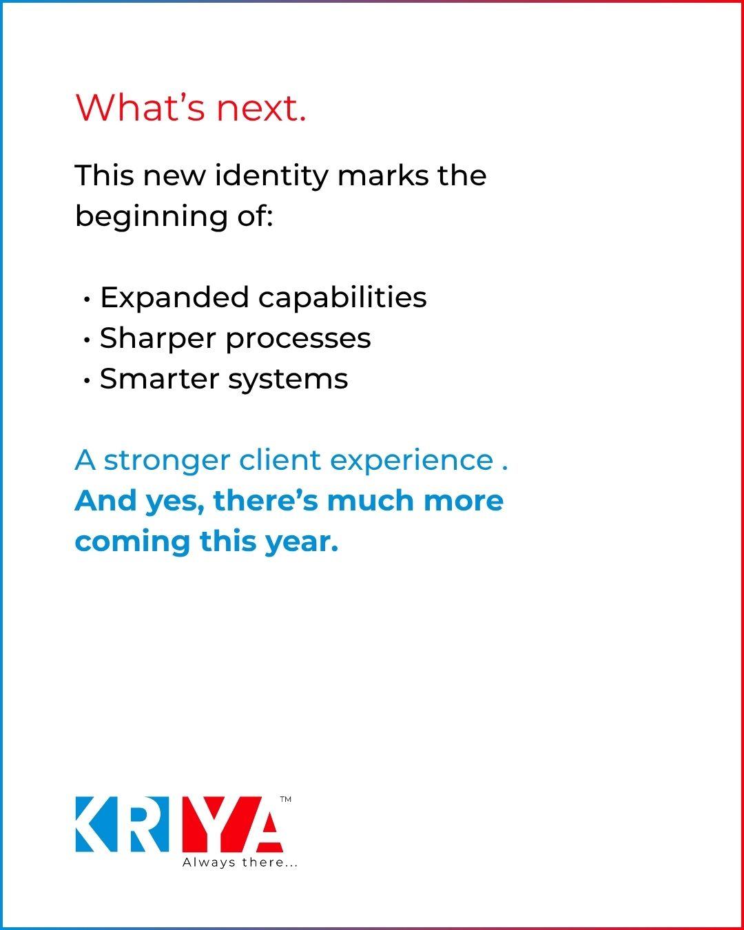
- One consistent identity across logo, print, office spaces, social media and website.
- A positioning story that moves Kriya from vendor to strategic partner.
- An always on social presence that keeps the brand visible between projects.
- A website and company profile that support the sales team directly.
Get started
Not sure what your marketing needs next? Let's find out.
Every strong marketing plan starts with a clear conversation. In this call, we will look at your goals, your current presence, and what a smarter path forward could look like.