
Ten branding tips that make a small business look established
16/09/20269 min readWritten by Dhvani, CEO at Sociowhiz
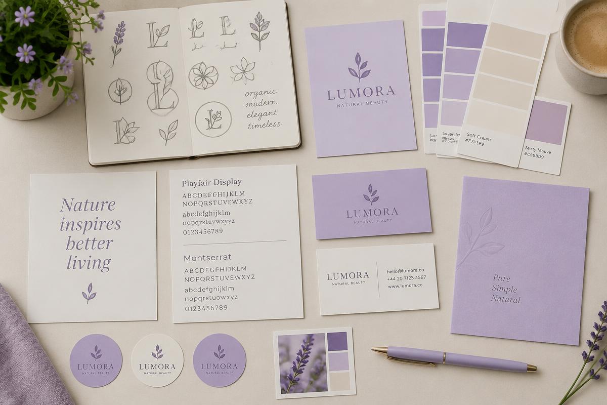
Buyers judge a business in seconds, and most of that judgement is visual. The good news is that looking established is mostly about consistency, which costs discipline rather than money.
Here are ten branding tips we apply when we build an identity from scratch, written so you can act on them whether you are starting out or tidying up a brand that grew in a hurry.
1 to 3: start with meaning, not colours
First, write one sentence that says who you help and what changes for them. Every design decision gets easier once that sentence exists. Second, pick a personality in three words, for example calm, precise, warm, and hold your copy and visuals to it. Third, decide what you will never do, because a brand is defined as much by its restraint as its choices.
Quick tip:
If your one sentence could describe five competitors, it is not positioning yet. Add the specific market, the specific problem or the specific way you work.
4 to 6: build a logo system, not a single file
Fourth, design a logo that stays legible at the size of an app icon. Fine detail disappears on a phone. Fifth, export a proper set: full wordmark, compact mark, one colour version and a version that works on dark backgrounds. Sixth, keep clear space around it and never stretch, recolour or add effects.
A logo system is what stops your brand looking improvised. When the team has the right file for every situation, nobody has to improvise with a screenshot.
7 and 8: restrict colour and typography
Seventh, use one primary colour, one supporting colour and a neutral range. Rainbow palettes read as amateur and make everything harder to lay out. Check contrast so text stays readable for everyone.
Eighth, choose two typefaces at most, one for headings and one for body text, and fix a small set of sizes. Consistent type does more for perceived quality than any illustration.
9 and 10: write like a person and stay consistent everywhere
Ninth, write your tone rules down: sentence case headings, plain words, no jargon, and the phrases you use for your services. A brand that sounds the same in an invoice, a caption and a proposal feels dependable.
Tenth, audit every touchpoint. Website, social profiles, email signature, invoices, packaging, vehicle, uniform, review replies. Consistency across the small things is what makes a five person business look like a fifty person one.
Quick tip:
Put everything in a one page brand sheet with logo files, colour codes, fonts and tone rules. If a new designer cannot brand something correctly from that page alone, the page is not finished.
When a refresh is worth it
Refresh when your brand no longer matches what you sell, when your materials look dated beside competitors, or when nobody can explain what you do in a sentence. Keep the elements customers recognise, sharpen the rest, and roll it out in one go so the change reads as deliberate.
We build logo and brand identity systems from $299, including the file set and a brand sheet your team can actually use. If you would like a candid opinion on your current identity, book a free call.
Related posts

Social media management in Brampton and Toronto: a local guide
What social media management costs in Brampton and Toronto, what a monthly service should include, and how local businesses across the GTA turn posts into enquiries.
17/09/2026 · 9 min read
Read article

Choosing a website development company in Toronto or Brampton
Website costs in the GTA swing from a few hundred dollars to five figures. Here is what changes the price, what a Toronto or Brampton business actually needs, and how to compare quotes fairly.
17/09/2026 · 9 min read
Read article
News letter
Growth insights, straight to your inbox.
One practical marketing idea a week. No fluff, unsubscribe anytime.